There’s nothing quite as subjective as the “perfect logo.” As a printing and sign company, we are often asked about logo design. While we prefer not to create logos, we care tremendously about the brands we serve so we want you to consider several factors when beginning a logo design.
The cost and the details
- The cost of logo design varies wildly, and that’s okay. Imagine what the rights to the FedEx logo are worth? You’ll need to stay within the parameters of what you can afford, of course, just understand the range can be shocking.
- You will need more than one version of your logo. Even if you decide against brand icons and other branding guidelines that can define who you are and what you do, you will at the bare minimum need:
- black version – jpeg, png (transparent background) and high resolution PDF
- white version – jpeg, png (transparent background) and high resolution PDF
- full color version – jpeg, png (transparent background) and high resolution PDF
- Vector files (usually a tiff or eps file or the original Illustrator file)
Ask your designer if you will be getting the full unflattened creation files. If they say no, move on. Sometimes, a designer will charge less for a logo and keep these files. Generally, they are created in programs you will not have on your computer. That’s okay, you can still store them for safekeeping.
- When you pick a font for your designer to use, it’s important to purchase a commercial license to use that font. This is true for any vector icons you might like to incorporate as well.
Finding a graphic designer
At Sign It Quick, we often refer our customers in need of logo design to 99Designs.com or Upwork.com to find a freelance graphic artist. If you’re looking for a custom logo, and you’d like a personal touch and a designer who will dig in and produce a logo that reflects your brand and message, we recommend our own marketing agency, Gravity Junction.
Putting thought into your brand & logo
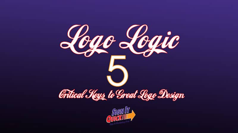
Think for a moment about the most iconic logos. The Nike swoosh, Apple’s … well, apple, the golden arches of McDonald’s, Chanel, and Mercedes-Benz. What do these logos share in common? They need no words, no tagline, not even a brand color to be recognizable to almost any American. Conversely, the artwork in the image above is typed in an astonishingly familiar font; care to guess the brand the lettering belongs to?
So, what is a logo? Really? In reality, Apple’s apple doesn’t illustrate much, does it? Think again! The apple was originally only a small part of the logo. The first iteration featured Sir Issac Newton sitting under an apple tree just before the offending fruit bopped him on the noggin and changed the world. The first logo was complex with a sketched scene, in a crest style plaque with a border encasing the tiny quote “Newton… a mind forever voyaging through strange seas of thought … alone,” and, a giant ribbon emblazoned with the company name wrapped around it.
 Digitizing the first Apple logo for embroidery on the genius’s shirts would have created a lot of expense and headaches. Let’s don’t even think about the brand colors that would have been needed to bring the logo to life. So, Steve Jobs, as he’s well known for, got smart. He hired a designer in 1977 to focus the brand on the apple itself. And while that very first Rob Janoff design reflects the era, one thing is unchanged. The very same apple, with it’s missing piece, is now known the world over. The original nod to Newton is not lost, and an Apple is from the tree of knowledge. While Apple has never acknowledged any biblical references, and they left Newton out of the logo years ago, the symbolism of the apple is strong. If you hold an Apple device in your hand, do you not now have the power to know? Great logos can connect the end-user to the ideas and feelings you wish them to have about using or owning your product or service. This is why they are important, and this is why they can be expensive.
Five Critical Keys to Great Logo Design
- Simplicity: Simple isn’t boring
Did you know that Leonardo da Vinci’s influence is present in today’s logos? His influence is seemingly everywhere, but especially in graphic design where the golden ratio is used religiously. Even Google subscribes to the aesthetics of 1.618 and followed “the divine proportion” in its logo and page designs. Simple logos often employ the golden ratio to recreate the beautiful asymmetry of nature.
We don’t want to break your brain with how you design using Phi, it requires math. To help you chat with your logo designer, we can crack the code a bit and elaborate.
Perhaps you’ve seen images of the inside of a nautilus shell and you’ve heard of something called the Fibonacci sequence. The golden ratio is closely related to this same visual concept of sequences. You can observe these sequences in pinecones and even in the helix of our DNA.
So, talk with your designer about a result that fits this aesthetic.
- Versatility: Think of all the places this logo will need to go
Your logo will be everywhere. Here at Sign It Quick, we can put it on windows, cars, floor graphics, wayfinding signage, and of course a traditional storefront sign. Those are not the only uses. Your logo will be on your website, on social media, in digital advertisements and on clothing like shirts and jackets. You’ll be asked for your logo if you sponsor a 5K, or if you enter a contest. When you begin to think of the different uses, it further enforces the idea that simple is best. You’ll also understand why we explained at the beginning of the article all the different versions you will need of your logo.
- Memorable: Opt away from cookie-cutter design
There are innumerable websites that will generate logos for you at the click of a button. These logos are typically very inexpensive and they look nice. The main issue with them is while you are generating logos, so are hundreds of other business owners. The icons and font combinations are endless. They are also rather cookie cutter and may not lend much to expressing your brand message. Worse, they can look extremely similar to other quick-fix logos already in use. A designer will talk with you, learn about what you do, understand what you are like to work with, and will help you create a simple, but powerful logo that you can be proud to put everywhere.
- Timeless: shy away from anything that dates your design
If you do a Google search for 60s logos, you’ll find a number of cool retro logos from days gone by. If you put those same logos in a line up with some of the iconic brand logos we mentioned above, the 60s logo will stand out like a sore thumb. If your business is a retro clothing shop, that’s perfect. If it’s not, there’s cause for concern. Ask your designer for a logo that won’t reflect a specific era. The best way to do this is to avoid overly stylized fonts. Two that come to mind are Papyrus and Bleeding Cowboys, these fonts scream the early 2000s.
- Appropriate: look carefully for accidental graphic issues
You might be surprised at the embarrassment that poorly thought-through logos have caused. While it’s funny now, and the subject of several articles and memes on the internet, it’s not a laughing matter if you don’t catch it before it’s made public. We’ve included two rather tame examples. The London Olympics logo was criticized for looking like everything from a swastika to Lisa Simpson on her computer. The Mama’s Baking logo is, well, interesting at best. The Detail Doctor is quite lacking in details, and they are using Papyrus, so they are literally without wheels and stuck in the past.


A logo is the very beginning of your brand story, and the ultimate goal is for it to be iconic (even if it’s just in your community). With the technical details to ensure you have what you need from a designer and a better understanding of how to guide the design for success, we are looking forward to creating signs for you soon.


0 Comments